
Redesigning a SAAS dashboard marketers use to build & manage Mobile Wallet Passes like Apple Wallet and Google Pay.


Plastic cards and paper coupons are huge sources of waste. Digital passes are cheaper at fractions of a cent each and more convenient to carry in your phone rather than a stuffed wallet.
Passkit is a product that allows marketers to design, build, and manage Mobile Wallet Passes for things like membership cards, digital coupons, or loyalty cards for both Apple Wallet and Google Pay.
The Challenge
Passkit knew that users were struggling to understand and use their beta dashboard.
Previously we redesigned how marketers created and edited mobile wallet passes. For this sprint, we wanted to create a more coherent experience for marketers at agencies managing multiple projects while raising awareness of how a paid account could help users.
Results
I redesigned the dashboard's home page, project page, navigation, pricing page, and implemented a design system.
These changes increased the conversion rate for subscriptions from 3% to 9%.
Note: You can sign up for a free Passkit account on the site to check out the redesigned dashboard.
My Role
UX Designer
Team
UX Designer
Technology Lead
(Full-stack Developer & Product manager)
Front End Developer
Scope
2 Months
Key Skills
SAAS
Usability Testing
Design System
UX Writing
What I Did
I led the redesign of Passkit's dashboard in these 2 months. The technology lead and I broke down this massive redesign into 2-3 week sprints by breaking down the goals and deliverables into more achievable bite-sized pages.
I ended up integrating a simple design system, rebuilt the navigation for projects, reframed the pricing flow, and updated the pages throughout the dashboard to align with common usability standards.
Project Process
The technology lead and I broke down this massive redesign into 2-3 week sprints with more tangible goals and deliverables for this time frame.
The main constraint we faced working in different time zones with me being in Los Angeles, the Technology Lead in the United Kingdom, and the front-end developer in Taiwan.
Redesigning an entire dashboard seemed like a ton of work so on a daily basis we set realistic goals on what we could work on and what we would have by the next day.
10 am to 5 pm
Whiteboarding and Wireframes
I spent afternoons taking ideas we came up with and fleshing them out into sketches or early designs I could share with the team.
5 pm (9 AM Taiwan)
Front-End Check-in
I met with the Front-End developer at the end of the day to get his impression on the latest design ideas and talk about how these could be implemented.
9 AM (4 PM UK)
Product Thinking & Brainstorming
I met with the Tech Lead in the mornings to set goals, ask questions about the back-end, and brainstorm/get feedback on designs.
Understanding the Problem
To identify the key problems PassKit's dashboard was facing, I first evaluated the product based on best practices on usability.
Then, I sat down with 7 users (primarily marketers at agencies) of Passkit for a quick interview and asked them to go through some common tasks in Passkit's dashboard so that I could understand and prioritize which problems from the evaluation were the most severe.
What They Tested

Passkit's old homepage - used to navigate projects

Old Project Dashboard - Used to manage a campaign
Key Problems
Based on those conversations with users and observations of their behavior during the usability tests, these were the 3 most pressing problems in the dashboard.
🏳️
Trust - Passkit's dashboard didn't "feel" like a powerful professional product to users.
🏳️
Navigation - Users struggled to understand an icon-centered navigation.
🏳️
Payment - Users didn't understand Passkit's premium service & payment model
Building Trust with Systems
Who we were building for
Passkit's primary user were Marketers. Primarily project managers in charge of a campaign at agencies or companies looking to save companies millions of dollars from switching from plastic cards to digital.

The first year we spent about $30,000 on the PassKit .
And it was offsetting
$6 million in cost of printing and distributing the plastic membership cards.
Tester 4 on helping a major banking company
Can you trust a rough product for a project worth millions?
The beta version of the dashboard was a bit messy and filled with typos, inconsistent language, and inconsistent use of icons and colors which led to users not feeling like it was a "professional grade" product.
Essentially users could feel that the platform strayed from common web conventions they'd expect from a power platform like Passkit.
A user's first impression is a typo on the sign up page

Users mistook these visual icons for buttons

Color
As seen in the photos above, the beta dashboard featured an array of colors.
The two main issues here:
1. Colors were used liberally without purpose with buttons being pink on one page but blue on others.
2. Accessibility - All the colors failed minimum web accessibility standards which means the colors were unreadable to those with color blindness. The yellow was unreadable to anyone.


The Solution: A Design System (click for details)


I took a UI Kit and worked with the Front End Developer to tweak it into a basic design system
Talking with the team, we realized the main issue is people were building so fast that there would be inconsistencies in how colors, font sizes, and even icons were used. I recommended adopting a UI Kit and tweaking that in a Figma file so that the team could adopt the same consistent font sizes, colors, shadows, and icons.
It was my job to add context to the UI Kit. I discussed with the team things like the importance of things like how sticking to one primary color, in this case, would feel more consistent. We used the blue shown above as a temporary placeholder while Passkit chose a more accessible primary color.
How the Design System fit in our process
From Ideas
We were tackling pages in generally 1 to 2 days. For me, days started with bouncing ideas and understanding constraints on the back-end with the Technology Lead.
To Sketches
Then I'd spend the afternoon either drawing sketches on the whiteboard or converting those sketches into wireframes.
The design system was key here as I didn't have to think too hard about font sizes, colors, and had production-ready buttons & form fields ready imported from the UI kit we based it off of.

Example Sketch of an email builder we made on Passkit
To Fleshed Out Design in 1-2 days
I would round the day out by meeting with the Front-End Developer and getting his feedback usually on these more fleshed-out wireframes.
Figma was incredibly helpful as the Front End Developer could easily pull out basic CSS, hex colors, and downloaded icons from that file.
Thanks to the design system we were working quickly, but not messy as we were referring to the same elements building the design.

The fleshed out design of the Email Builder after two days
Untangling Navigation

Old Home Page
Users didn't understand that the large icons text were links to an individual project for a mobile wallet pass campaign.

New Home Page
To address that, I implemented cards and shadows to clearly group and separate information.
We included a label for "Projects" to make it clear to users that each card is a project.
I also added data Passkit had on the backend into the cards and added sorting and filtering so users can quickly navigate through projects.

Old Project Dashboard
This page is the hub and most frequently used page by marketers to build, edit, and manage a mobile wallet pass campaigns.
When I asked users to find things they would often get lost and it took them several attempts to accomplish their tasks.
A major contribution to this was that there were two navigations in projects, one on the left and another on the top right.
The second navigation was also too icon reliant

Users wasted minutes hovering over the navigation each test.
The old dashboard displayed the navigation of a project with only icons. To read what each icon was, users had to hover over it.
In tests, users would frequently hover over each icon from left to right and try to remember them. They always would forget a couple of them and had to frequently waste time hovering over every icon to read it again.

New Project Dashboard
The technology lead and I decided to go with one navigation on the project page because people were overwhelmed by the number of choices before.
Instead of the confusing icons that users had to hover over, we clearly spelled out each section of the navigation.
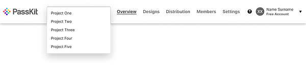
Navigating Projects
We were able to simplify two navigations into one by moving the main feature, switching projects, into a drop-down menu.
In the second round of testing, 5 out 5 users understood the menu at a glance.
Raising Awareness
How does Passkit make money?
Passkit allowed users to build "test passes" for free but to launch a pass commercially you had to subscribe to Passkit's "Production Mode"
Talking to the Tech Lead who also gave customers tutorials, he mentioned that users often didn't know they needed to be in this mode unless they're told.

People had to click a toggle in the old dashboard to learn about their premium services. It wasn't findable in the first rounds of tests.
Sandbox Mode? Production Mode?
"Sandbox" mode was essentially a testing mode and Production Mode was the paid mode that allowed people to launch passes,
The beta dashboard was filled with confusing terms that made sense to the developers and Passkit team, but not to new users.
I see this toggle that says viewing sandbox data...
I don't know what that means, sandbox data?

Tester 3 on the mysterious "Sandbox Mode"
PassKit Premium
I suggested simplifying the language of these "modes."
Instead of "Sandbox Mode" we can use this announcement throughout the dashboard to tell people that this is a "test project"
I suggested we change "Production mode" into "Passkit Premium" so that it'd be clear that this would be a paid "premium" service.

Alerts were added throughout the dashboard for all free projects.
But how much does it cost?
The old dashboard's payment page didn't tell users anything about the costs of Passkit.
It just expected you to plug a credit card in without context which users were not comfortable with.

Passkit's Old Payment Page
Complicated Payment Formula
Passkit's payment system is quite complicated. It's essentially a subscription which price scales with the amount of Mobile Wallet Passes the user sends.
This gets a bit more complicated as they have two separate rates for two types of passes.

Image of Passkit's Pricing Plan
A pricing calculator?
Passkit previously had a very basic calculator for one of their products and talking with the front-end we decided to feature that on this page to be an easy way to display an estimated cost.
This was the first take of what a Pricing Page might look like. When we tested this in our 2nd batch of usability tests, users appreciated being able to see the price but were overwhelmed by the information.

1st Iteration of Pricing Page, Sliders to show price
(Click to Zoom)
How might we make this complex info more understandable?(click for details)


A Simplified Pricing Calculator & Checkout
Since users talked about how the first iteration of the pricing page overloaded them with information, we simplified the page to a dedicated calculator and the benefits to better sell Passkit's dashboard. Talking to users and customer support, the main problems were people want to know what they have to pay monthly and people didn't know when they'd be charged.
To solve this we ended up using two sliders for the number of mobile passes people were looking to send and displayed the monthly total and next payment date (at the end of the month).
Furthermore I made sure to emphasize in checkout that people wouldn't be paying $0 today and that they'd be charged at the end of the month.
Clearing Up Payments
Key Takeways 🔑
Get Ready before Sprinting
Previously the team was working fast at the cost of consistency and usability.
Users noticeably had a rough time throughout the product.
Putting a design system in place before redesigning the whole product put a foundation in place for the team to work fast, but not at the cost of usability.
It's complicated so ask questions
I never could've redesigned this product by myself. Mobile Wallet Passes are super confusing! The Technology Lead's background with the Back-End development of how Passkit worked was invaluable to being able to create designs that could fit into their systems.
Not only that, the Front-End developer was amazing as well. He was very open and curious about how we could use the design system. We would chat and he'd had great alternatives if something was feasible, but often he made it work and had an MVP version of the site coded in about a month!